About the Service
Peacock Design Solutions designs the inside of children's books — the part a child actually spends time with. We illustrate and lay out picture books, early readers, chapter books, activity books and school readers for publishers, educational imprints and self-publishing authors.
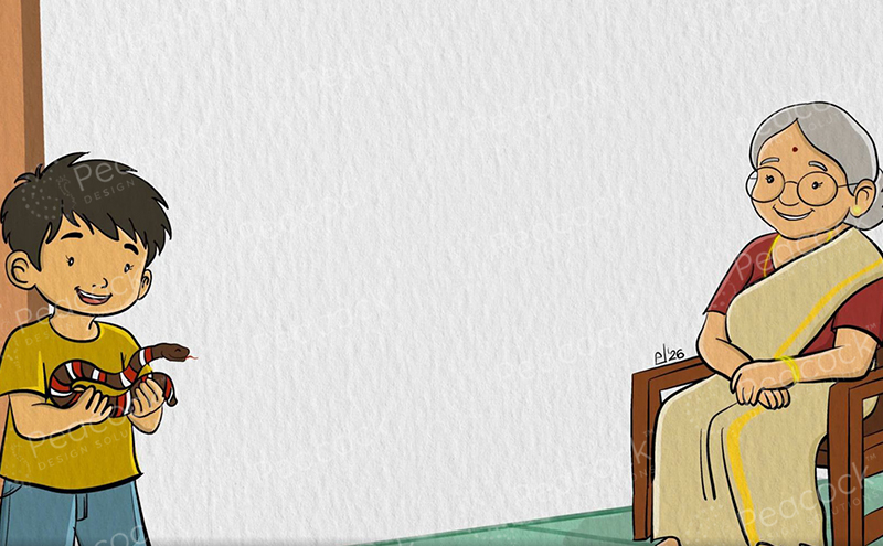
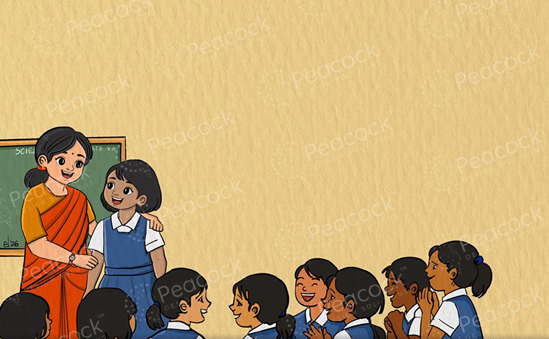
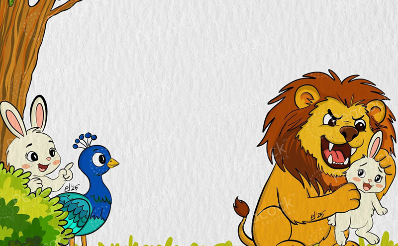
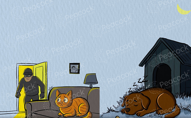
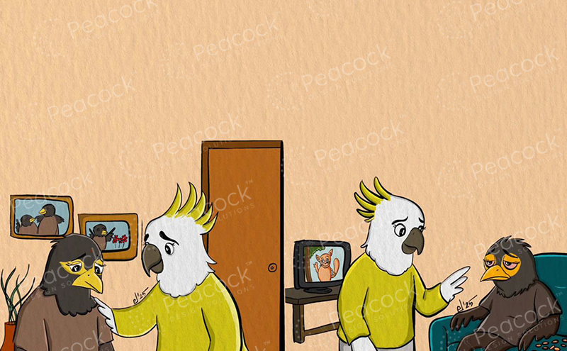
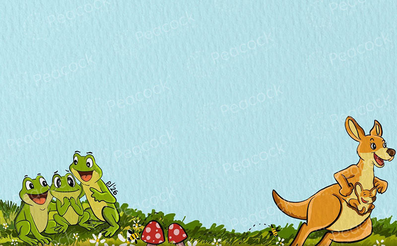
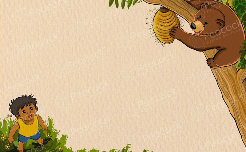
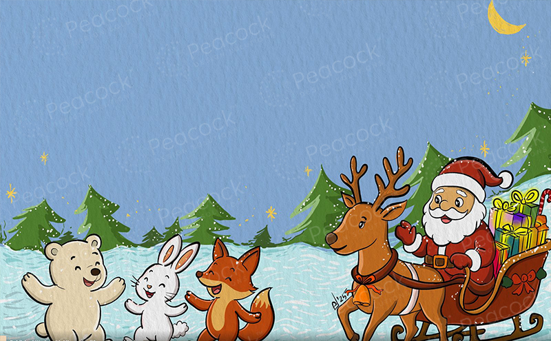
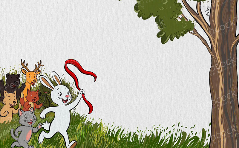
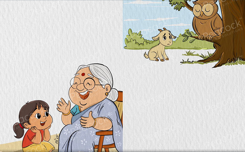
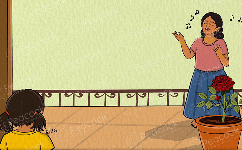
Look closely at the pages below and you'll notice something they all share: a large, deliberately quiet area where nothing is happening. That is not empty space. That is where the text goes, and it was planned before a single line was drawn. When the illustration is composed around the words rather than the words squeezed onto a finished picture, the page reads cleanly at any size and the typesetter never has to fight the art.
We handle the unglamorous part properly too: margins that survive binding, gutter allowances that keep a character's face out of the spine, type sized for the reading age, and files that pass your printer's preflight the first time.
Turn on Show text area to see the space each illustration leaves for the story.
Interior design for every kind of book a child will read.
Illustration composed around a reserved text area, so the words sit in clean space instead of being dropped on top of busy artwork.
Full 32-page signatures planned spread by spread, with illustration placement, text positioning and page-turn pacing settled before typesetting begins.
A thumbnail storyboard of the whole book before layout starts, so you can see the rhythm of the reading experience and approve it early.
Type size, leading and line length matched to the reading level — open and generous for early readers, tighter as the age band rises.
Task panels, answer spaces, tracing guides and instruction type laid out so a child can work on the page without the design getting in the way.
Bleed, gutter and safety margins set to your printer's spec, plus reflowable EPUB or fixed-layout files when a digital edition is needed.
Nothing important crosses the spine. Faces, hands and key text stay clear of the gutter, with the allowance set to the actual binding method.
Every spread ends with a reason to turn. We place the beats so the surprise lands after the page-turn, not before it.
Flat walls, open sky and plain ground are drawn in on purpose. Every page ships with somewhere the text can sit and still be read.
Words per line, sentence breaks and hyphenation rules set for the age band, so a new reader never loses their place mid-sentence.
One set of paragraph and object styles drives the whole file, so a late text change doesn't reflow page 14 into something different from page 15.
Colour space, image resolution, embedded fonts and bleed all checked against your printer's spec before the file leaves us.
You send the final text, the age band and your printer's spec sheet. We flag anything missing before we start.
The whole book mapped as small pages, with the text area marked on each one, so pacing and page breaks are agreed early.
Two or three finished pages set the art style and typographic grammar for the book. Once you sign these off, the rest follows.
The complete interior illustrated and typeset, with a reader's proof PDF for your proofreader and two structured revision rounds built in.
Preflighted print PDF, ebook files if required, and the packaged source document with all fonts and links.
Send us the manuscript, the age band and your printer's spec. We'll come back with a storyboard and a fixed quote — and you'll see sample pages before we commit to the full interior.